
.gif)
Key Takeaways
Whether you agree or not, marketing and psychology go hand in hand. You can never sell or perhaps be a good marketer if you don't put efforts in understanding the psychology and interests of your target audience. The same holds true for restaurant marketing as well.
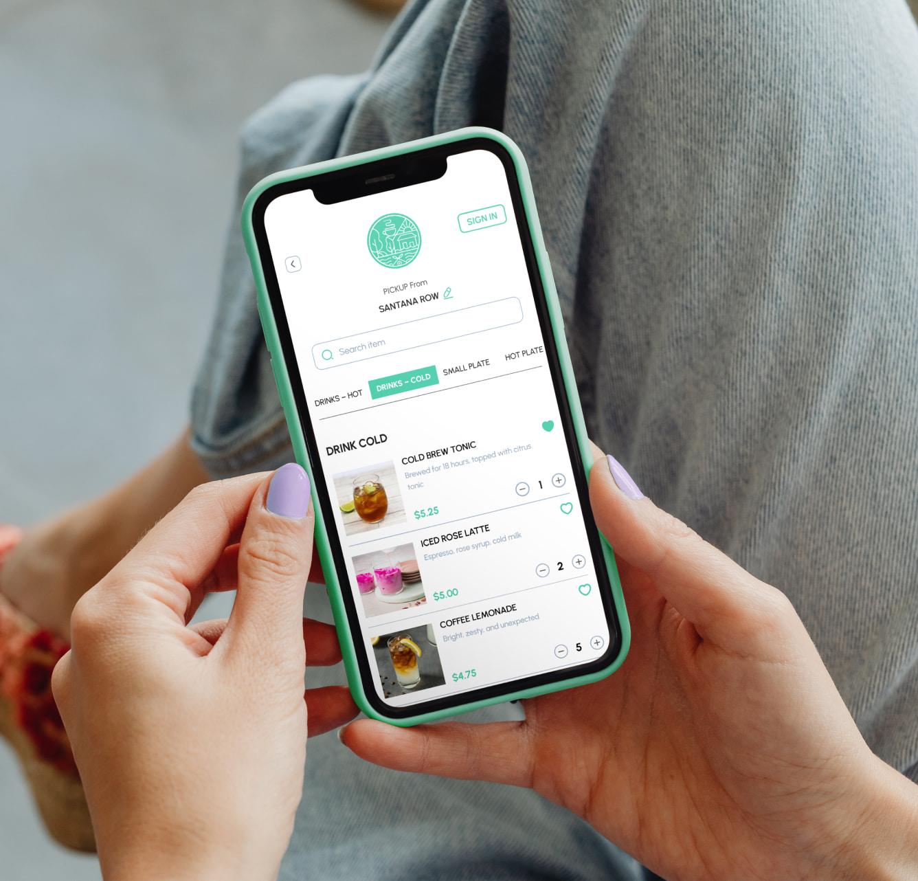
Responding to the rise of online ordering and growing demand for unconventional content, restaurants having an online presence will have to do a lot more than just throwing in a few enticing food pictures every day on social networks.
Restaurant Marketing is evolving and that means that each and every digital asset that you own as a brand needs to evolve too. Today, we’d like to start with your restaurant menu.
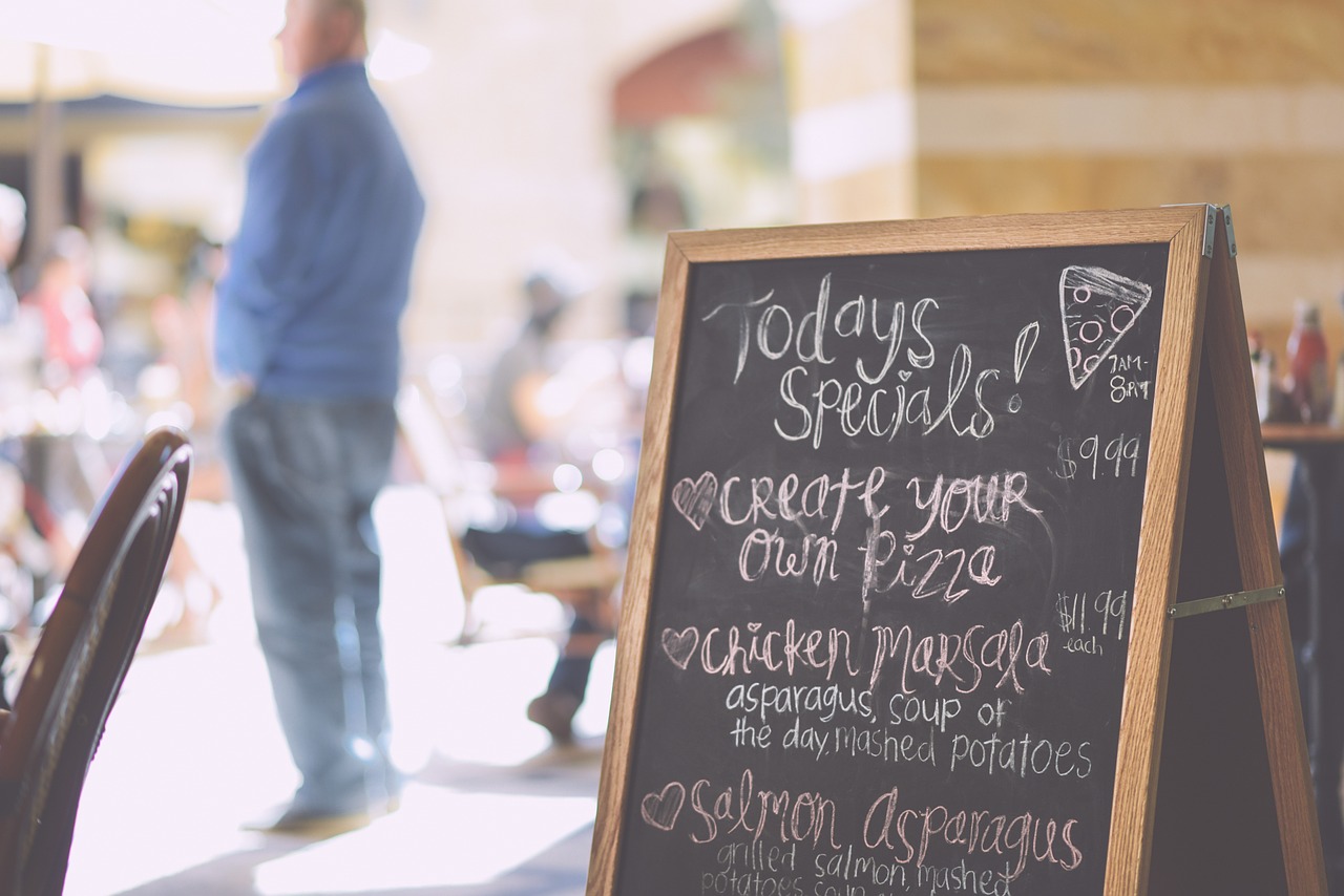
It's no secret that restaurants use design hacks to tempt their customers to order more. What might surprise you is that a lot of brainstorming and sheer sophistication that goes in delivering the final outcome. As a result, customers end up ordering more than they crave for, almost all the time.
Let’s start with a small test!
Take a look at one of your competitor’s menu, and skim through the content of the menu. Now answer the following questions:
At any point of time, did you pause for a tiny moment wondering what that dish would be like?
Did any particular section of the menu deserved a second look?
Did you find any peculiar, non-conventional element in the menu?
Lastly, did you answer all the above questions with a “Yes”?
It was kinda fun, wasn't it? It seems like your competitor has put in a lot of thought in designing his menu and believe it or not, it is getting him good sales.
People are ordering more from him. They want to know how that "new thing" in the menu tastes like. They want to experiment with their pallet because the menu design is persuading them to do so.
“Menu engineering is a science and a strategically engineered menu will not only push your most profitable dishes but also up-sell to your guests.”
Today, we'd like to share 5 menu design hacks that will help you reach your revenue goals faster and sooner.
Limit their choices
Yes, you read that right. Contrary to the theory that a brand should be able to provide their customers with a plethora of choices, we'd like to suggest that your menu should not have more than 5 items per section.
Having more than 7 food options in one category tend to overwhelm the guest, and when they get confused they'll typically want to stick to what they know best. By complicating the menu we're are actually tormenting the customers.
As a result, they feel less satisfied with their choice and chances are that they would not come back to your restaurant for a long time. Give them limited, but palatable options. Encourage them to try new things by clearly mentioning the ingredients of every dish. Let them make a choice and this time a different one!
Use eye magnets
Like how food magazines do to highlight certain dishes that they want us to try out from the particular restaurant. In simple terms, an eye agnet is anything and everything that attracts the eye to stimulate action. The idea is to keep the customers from heading straight to the pasta or noodle section.
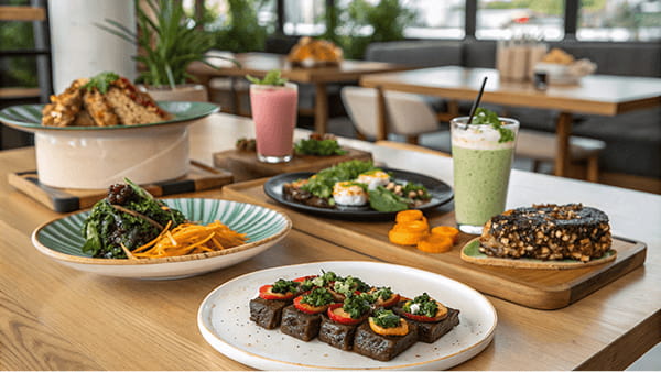
But how do you expect customers to order chef's special salad if they don't even know how it looks like. Including a vivid image alongside the food item is one way to increase the sale of that particular dish by 30 percent. A hungry guest will always prefer to order a dish that he can see. The effect is even more when it comes to online ordering.
Another most used menu design strategy is to use a shaded box or frames to highlight certain dishes. Elements like ribbons and arrows are also good stimulators for guests skimming through the menu.
Use exotic names
Using fancy language to name otherwise boring dishes is one of those menu hacks that's as old as menus themselves. Adjectives like “fresh from the farm,” “organic,” or “spice crusted” or "beer braised" are big turn-ons for customers. So plain old "Red Pasta" becomes "herb spun angel hair pasta cooked with sugo all'arrabbiata.” This also means that you can convince them to pay more for such an exotic dish.
Increase perceived value
How do you make your dishes look reasonably priced when you are charging more than the double even for basic dishes like noodles, fried rice, and burnt chocolate mousse? Well, the term is "Decoy". A decoy is a menu item with an outrageous price placed right at the top of all the other dishes so other dishes (perhaps overpriced ones) seem less expensive.
For example. The most expensive entree, Kabocha Squash Gnocchi, is $82 — more than double the price of any of the dish in the menu. While most people might not want to pay $82 for a few pieces of gnocchi, they might just stick with chicken steak being sold for $32 as it will look a little more affordable option.
Use colors to stimulate appetite
Clever typography and bold colors are the techniques that menu engineers swear by. Most restaurants use shades of red, yellow and orange as these colors are known to stimulate appetite and induce excitement. Red and yellow combined together are considered best stimulators for hungry customers. White colors like blue and green draw in more attention. In fact, most seafood-centric restaurants choose Blue, bringing to mind the essence of fresh, ocean-caught fish. On the other hand, restaurants serving organic and healthy food tend to go with shades of Green to induce the sense of nature into their branding.
Ready to use these hacks in your restaurant menu design? It’s time to apply your creative genius!
What other menu hacks have you tried? – we’d love to hear it in the comments below!
Quick Tip From Us: Whether you're an established restaurant owner or a starter, it's always good to see what your competitors are doing in the industry. Particularly, the ones that are attracting a lot of attention. It can inspire you when making our own business decisions.

Team Restolabs is a group of hospitality tech experts, strategists, and innovators dedicated to helping restaurants thrive in the digital age. With deep expertise in branding, growth, product development, and restaurant technology, we provide insights on scaling, streamlining operations, and enhancing customer experience.
Frequently Asked Questions

%2520(10).png)


.png)


.webp)

.svg)
.webp)